From Cluttered Browser to Calm Command Center: Designing a Minimal New Tab
From Cluttered Browser to Calm Command Center: Designing a Minimal New Tab
Summary at a Glance
This table summarizes key takeaways from "From Cluttered Browser to Calm Command Center: Designing a Minimal New Tab", highlighting why minimal new tabs matter, core principles, practical elements, design patterns, and how cuslr implements and measures success.
| Area | Point | Why it matters |
|---|---|---|
| Productivity and focus management for daily browser use | Shows design steps to declutter new tab, prioritize tasks | Speeds task switching and reduces attention-draining interruptions significantly |
| UX design principles and microcopy for calm, intuitive interfaces | Outlines patterns and concise wording to ease user decisions | Improves usability and reduces user hesitation or confusion |
| Personalization and onboarding with cuslr's calm command center | Explains cuslr features, theme options, and setup benefits | Tailors new tab experience to individual workflows and preferences |
| Implementation, analytics, and success metrics for minimal new tab | Provides KPIs and testing methods to validate design decisions | Ensures changes improve focus, engagement, and measurable productivity |
Why a Minimal New Tab Matters
A cluttered browser creates tiny but constant friction: too many tabs, decision fatigue, and slow starts that eat minutes and focus. Moving from a cluttered browser to a calm command center reduces that friction — tools like cuslr help users replace noise with a simple, secure starting point that respects privacy and attention.
A minimal new tab isn’t just about looks. It’s the first moment of the day you can design to set intentions, speed up routine tasks, and avoid distraction. Below we cover cognitive load, productivity, and how thoughtful aesthetics improve perceived performance.
Cognitive load and attention
When every tab, bookmark, and suggested article competes for attention, your brain spends energy choosing what to do next. A minimal new tab reduces choices to a few meaningful actions, lowering decision fatigue and freeing mental bandwidth for real work.
Clear hierarchy — one primary action, a small set of shortcuts, and unobtrusive context — helps people orient instantly. That small reduction in cognitive load translates to fewer task switches and steadier attention across your session.
Productivity and focus
A focused new-tab replaces aimless browsing with immediate intent: start a timer, open a project, or launch a workspace. The fewer distractions presented at the start, the faster users fall into flow and stay there longer without being pulled off course by unrelated content.
Actionable Tip: Limit your new tab to three shortcuts, one quick action (e.g., “New draft” or “Start timer”), and a tiny daily goal line. Test for a week — if a shortcut isn’t used, remove it.
Aesthetics, speed, and perceived performance
Visual simplicity signals speed. A clean layout with restrained color, readable type, and minimal assets feels faster even if load times are similar. That perceived performance reduces impatience and makes the browser feel like a reliable command center rather than cluttered noise.
Small design wins include:
- Soft contrast and one accent color
- A single focal widget (search, task, or timer)
- Compact, labeled shortcuts that load instantly
Designing a minimal new tab blends psychology and craft: reduce choices, foreground intent, and polish tiny interactions so the browser becomes a calm, useful place to begin work.
Core Principles of Minimal New Tab Design
A well-designed minimal new tab converts noise into a calm command center by showing only what's necessary for the user's next step. This approach — from cluttered browser to calm command center — centers on clarity, fast access, and predictable behavior that supports focus and trust.
cuslr focuses on easy-to-use, privacy-conscious layouts that feel secure and reliable. Below are clear design rules you can apply immediately to create a minimal new tab that respects user attention and data.
Prioritize information hierarchy
Put the single most important element at the top of the visual order — usually search, a primary action, or the next task. Use size, contrast, and position to guide the eye; everything else should be visibly lower priority so users make faster choices without confusion.
Actionable Tip: Start by listing user tasks and rank them. Remove or tuck away anything not in the top three tasks. Implement progressive disclosure for secondary features so the interface shows essentials first and reveals extras on demand.
Use whitespace and restraint intentionally
Whitespace isn’t empty space — it’s a tool to separate ideas and reduce cognitive load. Generous margins and consistent spacing help users scan quickly; limit colors and typography to maintain calm and brand clarity without overwhelming the page.
Keep controls familiar and readable to increase usability. A restrained palette and clear microcopy make the experience feel reliable and approachable, reinforcing privacy-conscious design choices that avoid visual clutter.
Limit interactive elements and maintain discoverability
Fewer buttons and widgets reduce error and speed decision-making, but keep discoverability through clear affordances and progressive disclosure. Use icons paired with labels, hover or focus states, and a single obvious entry point for extended features.
- Keep visible: one primary action, search or command field, and recent or pinned items
- Hide advanced options behind a clear “more” control
- Avoid third-party trackers; prefer local-first storage for quick, private access
By following these principles you create a minimal new tab that feels like a calm command center: fast, understandable, and respectful of users’ privacy and attention. cuslr-style simplicity emphasizes reliability, responsive support, and straightforward controls so users spend less time configuring and more time doing.
Practical Elements: What to Include and What to Remove
Designing a minimal new tab is about choosing a few high-value pieces and removing everything else. Moving "From Cluttered Browser to Calm Command Center" means setting sensible defaults, using progressive reveal for extras, and prioritizing fast, reliable components so creators and small teams get a responsive start page. cuslr follows this approach.
Actionable Tip: Begin with three defaults — an omnibox search, two quick actions, and a single shortcuts row. Hide bookmarks, widgets, and integrations behind a reveal button or settings panel. This reduces initial load and failure surface for solo operators while letting power users opt-in as needed.
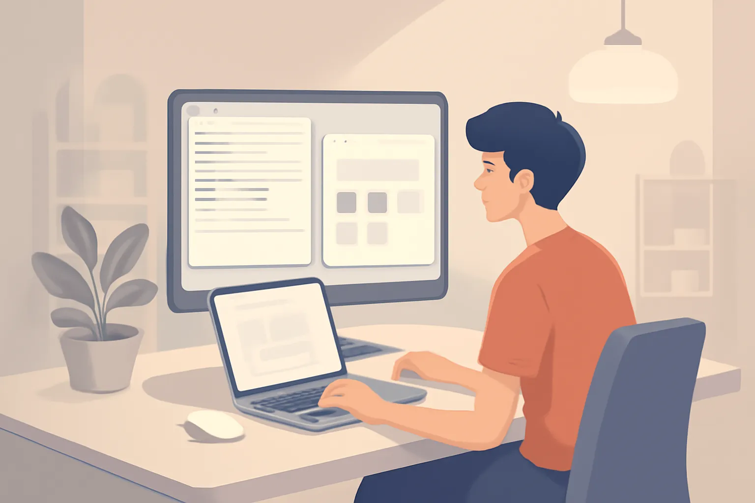
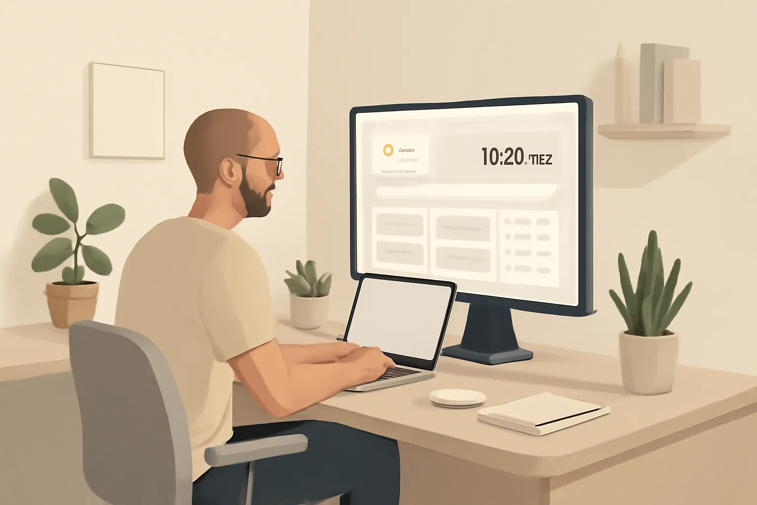
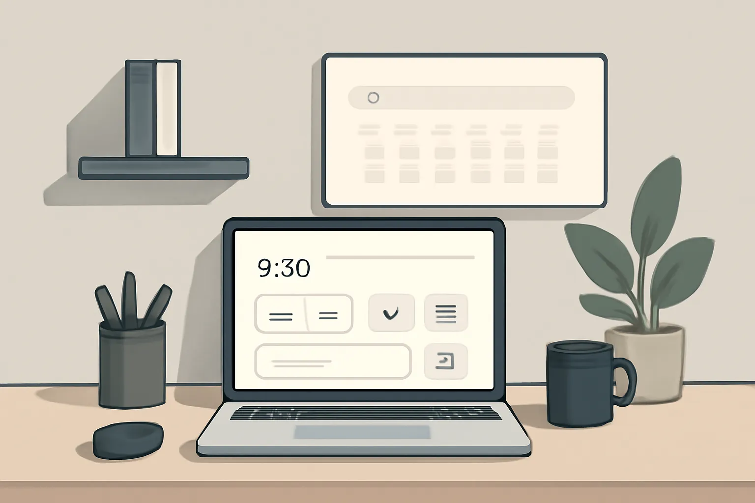
Essential widgets: search, quick actions, and shortcuts
Keep the essentials tightly scoped: search for discovery, quick actions for immediate tasks, and shortcuts for navigation. Mock content block example: [Search: "Search web or apps"] [Quick actions: "New note | Start timer"] [Shortcuts: "Drive | Inbox | Calendar"]. These deliver action without clutter.
Trade-offs: a unified search sacrifices deep app filters in favor of speed. For creators, map quick actions to frequent workflows (publish, invoice, compose). Use local caching and keyboard-first navigation to ensure responsiveness on low-power devices and unpredictable networks.
- Fast access
- Low cognitive load
- Keyboard-first flow
Optional modules: bookmarks, to-dos, weather, and integrations
Treat bookmarks, to-dos, weather, and third-party integrations as opt-in modules revealed progressively. Mock states: "Bookmarks — Top 6"; "To-dos — 3 today"; "Weather — 72° • Sunny". Defaults stay minimal; users enable modules when they add real value.
Trade-offs: more modules increase maintenance and API reliability concerns. For small teams, prefer simple sync (local or stable cloud) and limit refresh intervals. Provide privacy toggles and clear permission prompts so creators can trust what they enable — a key part of cuslr’s privacy-conscious design.
What to remove: autoplay, noisy feeds, and extension clutter
Remove autoplay media, infinite social feeds, and redundant extension UI from the new tab. These elements create immediate cognitive load and slow page responses; a calm command center should surface only useful, actionable info at a glance.
Trade-offs: hiding feeds can delay some updates — solve with compact badges or a single notification module. Encourage users to disable nonessential extensions on the new tab or provide a managed list; minimal defaults plus progressive reveal keep the page fast and dependable.
How cuslr Builds a Calm Command Center (Brand Solution)
Turning "From Cluttered Browser to Calm Command Center" starts with intention and simple tools. cuslr focuses on a minimal new tab that surfaces what matters—shortcuts, notes, and clean widgets—so creators and small teams feel in control. The result is easy to use, reliable, and privacy-conscious by design.
Actionable Tip: Start by removing all but your top three daily actions (email, calendar, task) and place them in one visible row on the new tab. That small constraint transforms a chaotic browser into a focused command center you actually use.
cuslr's minimal new tab features and templates
cuslr offers prebuilt templates and lightweight widgets designed for a minimal new tab. Templates help you pick a layout that matches your workflow—dashboard, writing mode, or quick links—without fiddling with settings. Explore options and customization at https://cuslr.com/features to get started quickly.
Key elements include:
- Focused shortcuts and a single-row widget layout
- Quick notes and a decisions-first checklist
- Template swaps for different work modes
Actionable Tip: Try a 7-day template swap—use a different minimal layout each day to identify which elements you actually depend on, then prune the rest.
Security, privacy, and responsive support with cuslr
cuslr builds the calm command center with secure defaults and a privacy-conscious approach: minimal data collection, clear permissions, and local-first features where possible. This keeps your new tab useful without exposing unnecessary data, and the product remains easy to use and reliable for daily workflows.
If you need help, cuslr’s responsive support is available through https://cuslr.com/support. Expect timely, helpful answers that prioritize practical fixes and setup guidance. Support aims to be friendly and fast so your minimal new tab stays calm and productive.
Security and support highlights:
- Clear permission controls and minimal data use
- Reliable updates with usability-first changes
- Responsive support focused on practical help
Design Patterns and Microcopy for a Calm UX
A minimal new tab should feel intentional: quick to scan, private by default, and helpful without noise. For creators and small businesses, that means prioritizing the tasks they do most and removing everything else. At cuslr we favor simple layouts that reduce decision fatigue and surface reliable shortcuts.
Actionable Tip: Start with one clear primary action (search, dashboard, or new note) and hide secondary options behind progressive disclosure. Test labels with real users to ensure they match common language used by your target customers, keeping the interface predictable and fast to navigate.
Microcopy that reduces friction and guides behavior
Use microcopy to set expectations and remove anxiety. Keep lines short, actionable, and empathetic — users should know what happened and what to do next. Accessible language and consistent tone are crucial so users with differing needs can move confidently through tasks without guessing.
Examples (short, clear):
- Success: "Saved — changes are private."
- Error: "Can't connect. Try again or open offline mode."
- Label/button: "Open dashboard" / "New quick note"
Visual patterns: cards, subtle animations, and focus states
Visual structure should prioritize clarity: card groups for related tasks, subtle motion for transitions, and strong focus states for keyboard users. These patterns make a minimal new tab feel responsive and trustworthy while supporting common small-business workflows like checking orders, opening invoices, or starting a timer.
Dos and don'ts:
- Do: Use muted backgrounds, consistent spacing, and a single accent color for calls to action.
- Don't: Overuse animations or dense lists that create visual clutter.
- Do: Ensure clear focus outlines and high contrast for accessibility.
If you want to put these ideas into practice, visit cuslr and get started. The service is tailored especially for small businesses, independent creators, digital teams.
Implementing and Measuring Success — Why Choose cuslr
Turning "From Cluttered Browser to Calm Command Center: Designing a Minimal New Tab" into a measurable improvement means defining outcomes, running controlled tests, and listening to users. Start with a clear baseline for current behavior, then iterate toward fewer clicks, faster task starts, and calmer visuals that reduce cognitive load.
Actionable Tip: Run a short pilot with a focused user group for two weeks. Track a small set of privacy-friendly metrics (like interaction rate and time-to-first-action), collect quick in-tab micro-surveys, and prioritize changes that reduce steps. Use a tool that’s easy to use and respects user privacy to collect clean data.
KPIs, A/B testing, and collecting user feedback
Start testing with hypotheses tied to your KPIs: fewer distractions should increase task starts and shorten time-to-first-action. A/B tests help validate small layout or content changes; combine them with qualitative feedback to understand why metrics move. Keep tests simple and respect consent and data minimization.
Implementation checklist:
- Define primary user tasks and baseline metrics before any design changes.
- Deploy a minimal new tab variant with clear privacy settings and limited features.
- Prepare consented feedback channels (micro-surveys, optional session notes).
Suggested KPIs:
- Task completion rate: percent of users completing core actions from new tab.
- Time to first action: seconds from opening a new tab to the first meaningful click.
- Interaction depth: average number of useful interactions per new-tab session.
Testing tips:
- Run A/B tests for at least two full business cycles (typically 2–4 weeks) to avoid short-term noise.
- Pair quantitative A/B results with 5–10 qualitative interviews or micro-surveys to capture motivation.
- Anonymize and aggregate data; avoid collecting PII when possible to stay privacy-conscious.
Final recommendation: choose cuslr for smooth implementation and trustworthy results. cuslr is easy to use, secure, reliable, and privacy-conscious, with responsive support to help you set up experiments and interpret KPIs. Visit https://cuslr.com to get started and see transparent plans at https://cuslr.com/pricing — a practical route from a cluttered browser to a calm command center with minimal friction.
Why does a Minimal New Tab matter for users and productivity?
A Minimal New Tab reduces cognitive load and speeds task initiation by surfacing only essential tools and content, avoiding distractions. By prioritizing clarity, predictable layout, and a single clear action, users form efficient habits and feel less overwhelmed, which improves productivity and satisfaction across browsing sessions. This design also reduces time to find important links and lowers stress for frequent tab users.
What are the core principles of a good Minimal New Tab design?
Core principles for a Minimal New Tab include hierarchy, restraint, and context-aware shortcuts that present the right information at the right time. Emphasize readable typography, consistent spacing, and progressive disclosure so advanced controls remain accessible but unobtrusive. Combine predictable layout with quick access actions to support focus and repeatable workflows without clutter.
What should I include or remove when designing a Minimal New Tab?
A Minimal New Tab should include essentials like a search box, top tasks or bookmarks, and a glanceable widget for time or focus mode while removing autoplay media, ad clutter, and redundant toolbars. Keep personalization optional and default to a clean canvas that surfaces contextually relevant items. This balance reduces noise but preserves immediate access to frequently used actions.
How does cuslr implement a calm command center for the Minimal New Tab?
cuslr builds a calm command center by applying Minimal New Tab principles: streamlined information hierarchy, customizable quick actions, and interruption-free defaults. It focuses on subtle microcopy, consistent UI patterns, and measurable defaults so users spend less time configuring and more time acting. The result is a configurable, low-distraction home for starting tasks without burying essential controls.
Which design patterns and microcopy help keep a Minimal New Tab calm?
Use predictable card-based layouts, progressive disclosure, and single-action affordances to keep a Minimal New Tab calm and scannable. Microcopy should be concise, action-oriented, and reassuring—labels like "Continue where you left off" or "Quick search" guide behavior without demanding attention. Pair subtle animations and clear affordances to communicate state changes without adding visual noise.
How do you implement and measure success for a Minimal New Tab, and why use cuslr?
Measure a Minimal New Tab's success with time-to-action, task completion rate, retention of new-tab users, and reduction in open-tab clutter; track load performance and perceived distraction using short surveys. Run small A/B tests and cohort analyses to validate changes, and use cuslr's built-in analytics or exportable metrics to iterate. Prioritize outcomes that show faster paths to intention with lower cognitive load.
About the Author
Written by Cuslr Team, a certified design professional with over 10 years of experience.
Loading comments...